8 Foods to Fight Stress
EDITORIAL // ILLUSTRATION // PHOTOGRAPHY
The goal of this project was to take a magazine article and design it to fit into two very different genres of magazines.
The article I chose was called 8 Foods to Fight Stress by Ardita Shah. There isn’t much copy and it has multiple sections for each of the foods. I thought this would provide an interesting challenge: trying to fill the magazine spread and also making it look like a real magazine article without long columns of text. I took inspiration from two styles I called the “self-help” magazine and a “lifestyle” magazine.
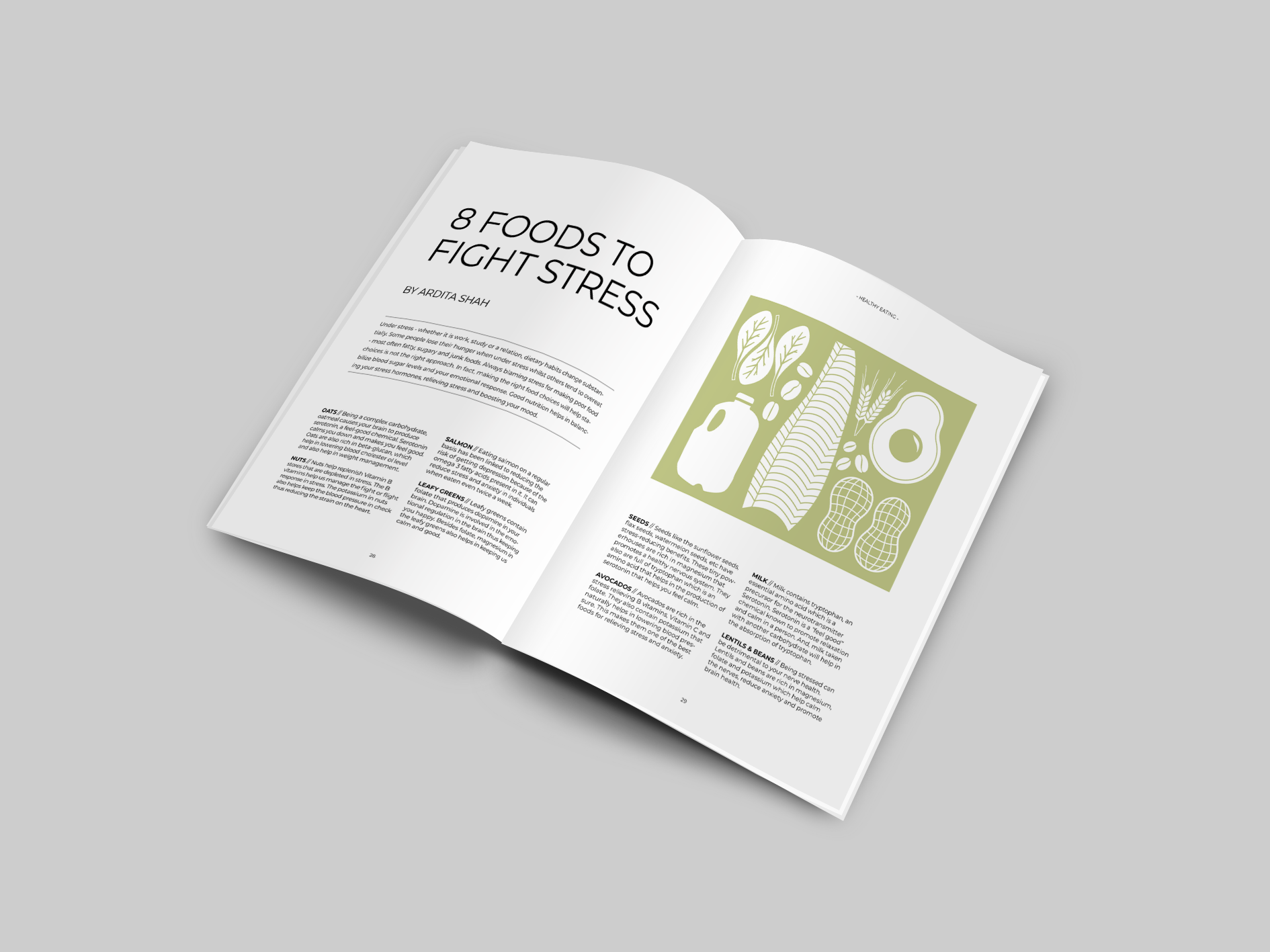
I found, through my research, that the self-help magazine had a very clean and simple aesthetic. Magazines like Breathe and Flow inspired the use of lots of columns and sans serif fonts in their designs. The text in these types of articles often adhere strictly to a grid and and use plenty of illustration to compliment the copy instead of photography.
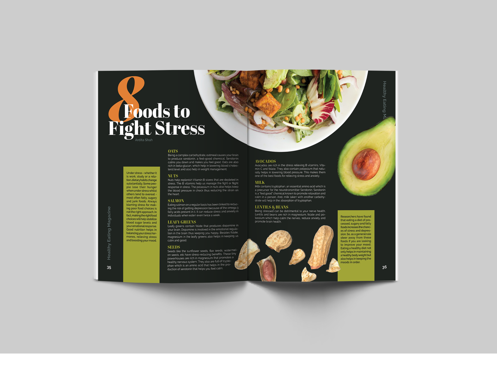
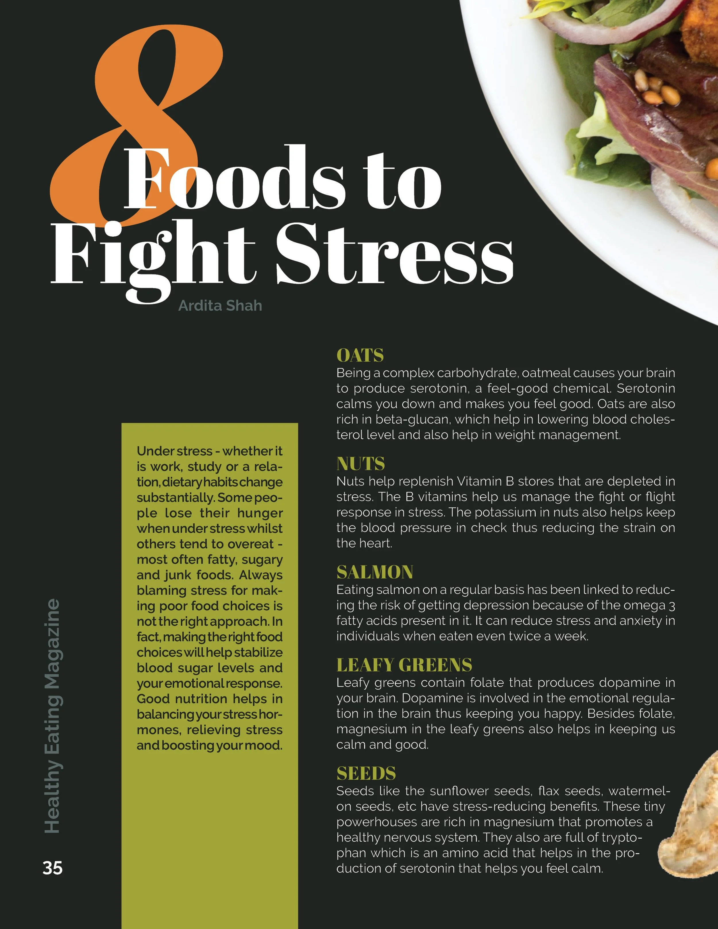
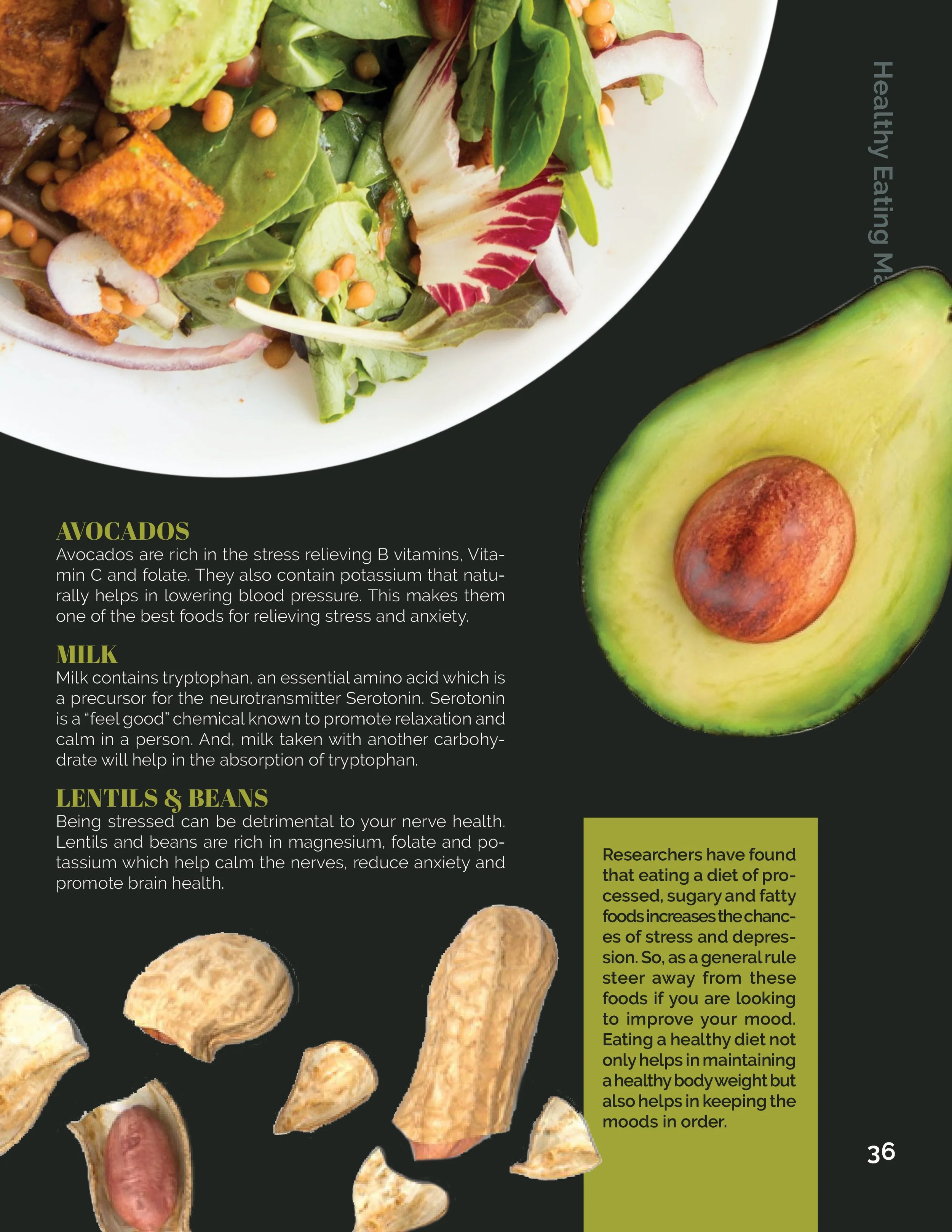
Meanwhile, I found lifestyle magazines like Women’s Health and Oprah tend to be overwhelming and eye-catching. Photography is the core of the visual style andmuch of the copy is pressure-inducing and evokes a feeling of FOMO. There are a variety of fonts creatively paired together and it tends to break the grid more often.
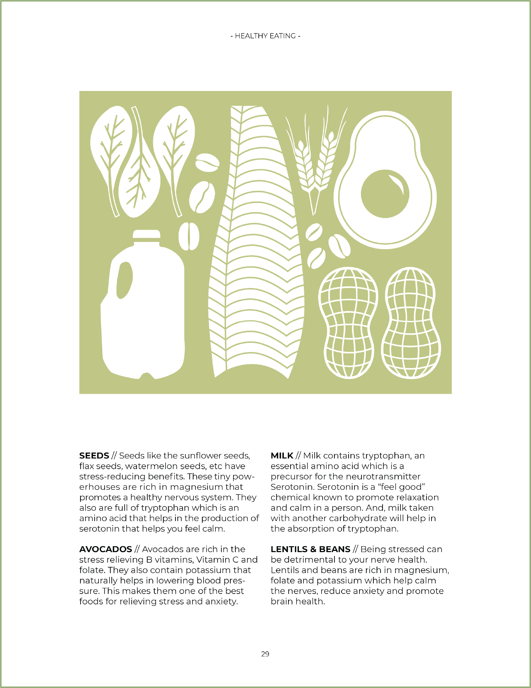
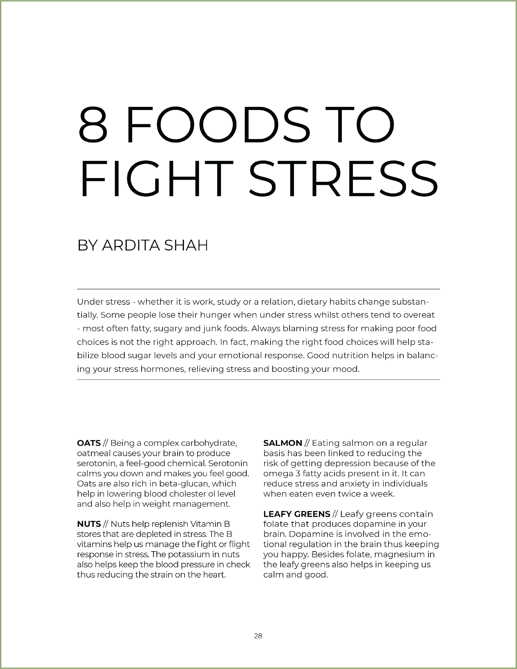
This is the self-help style of magazine and I took a simpler, calmer approach. All the text from the article title, to the subheadings, and the body copy, is all the same font - just different weights. All eight sections are organized into four columns across the two pages and I included a simple illustration for visual interest.
This is the lifestyle magazine in which I used a variety of different fonts and two columns of text for the main part of the copy. The introduction and the conclusion paragraphs break the grid and make the design more dynamic. I also used colorful photography as the eye-catching visual that takes up most of the spread with the article title being a focal point.
