National Park Typeface Booklet
Print // Illustrator // InDesign
The National Park Typeface Booklet is a visual examination of the National Park typeface which was created by the Design Outside (DO) Studio in 2012.
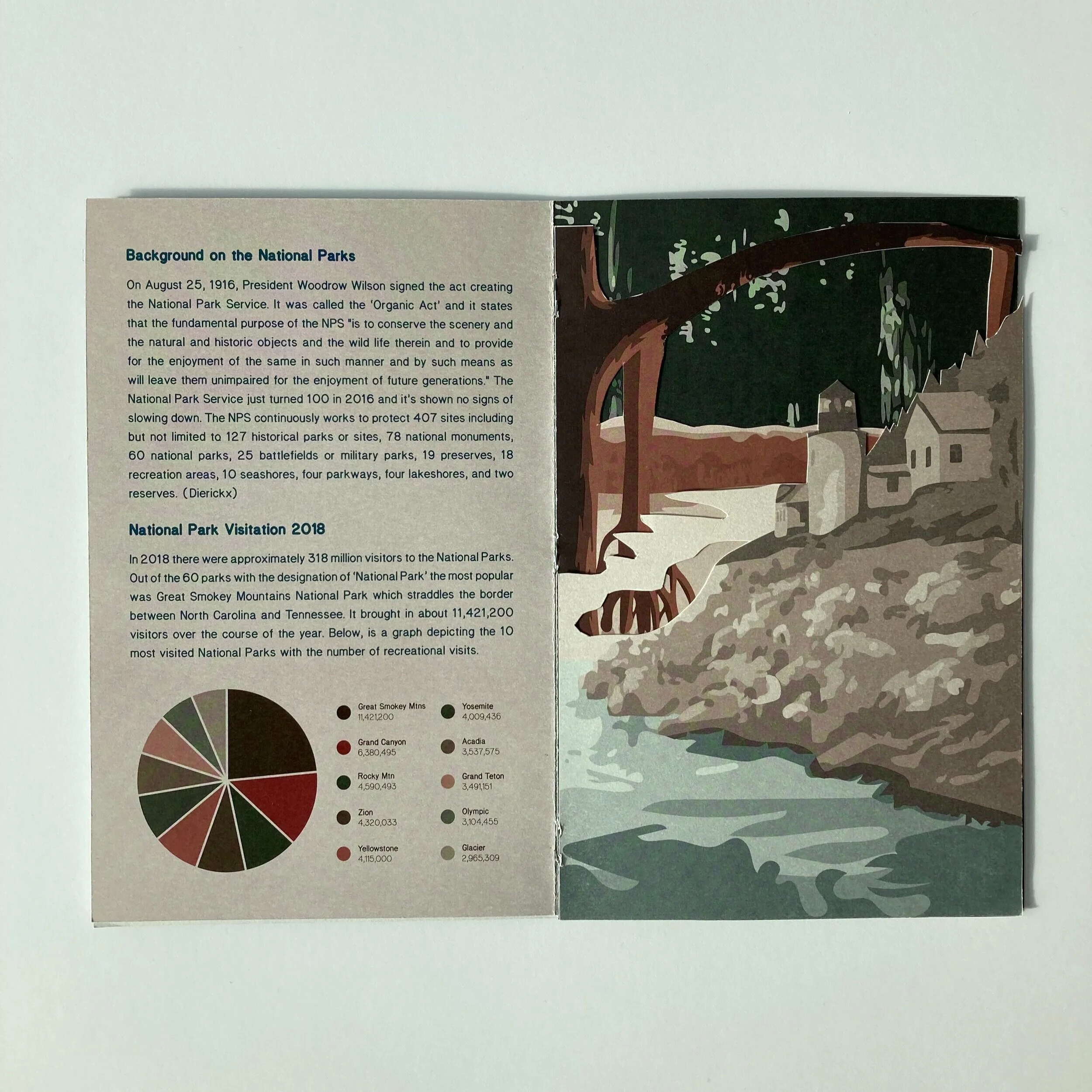
It was created in InDesign with elements brought in from Illustrator, and goes in depth into exploring the history and anatomy of the typeface, while celebrating America’s National Parks.
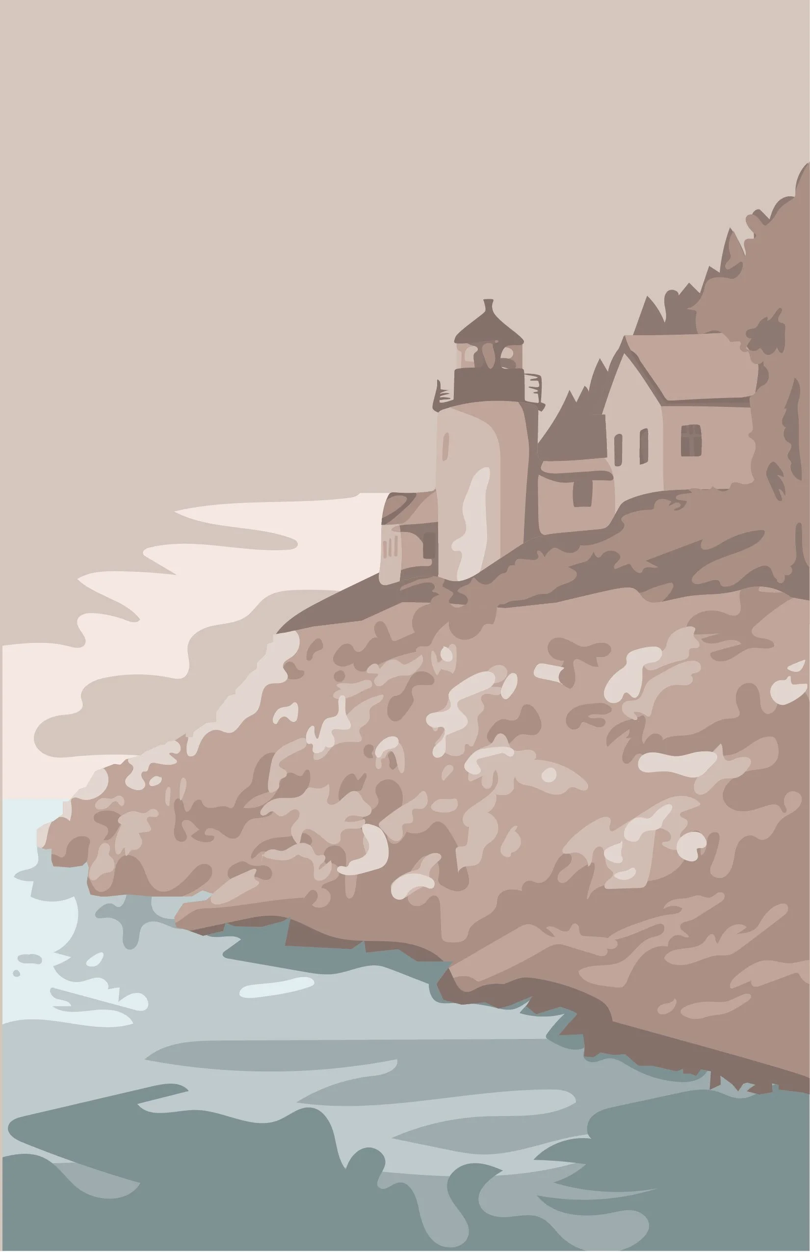
A big source of inspiration for this piece is the WPA-style National Park posters designed in the mid to late 1930s. They always catch my eye and I’ve always wanted to design a project that draws heavily from that art style. To do my illustrations for the typebook, I did a lot of research on the National Parks and those WPA posters before I even started sketching.
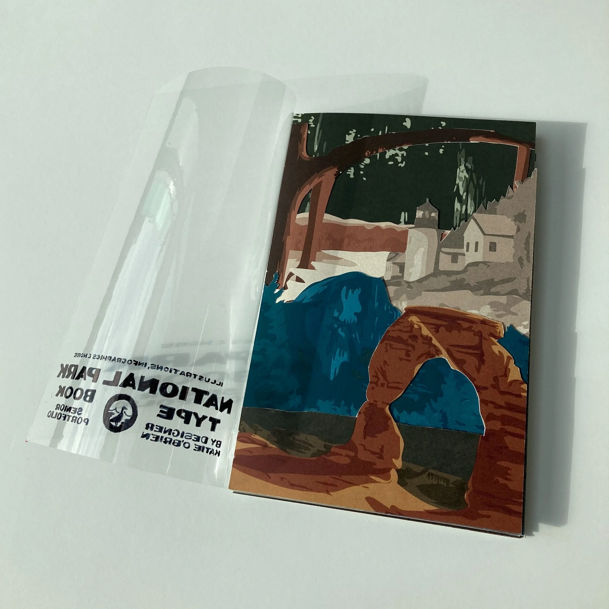
The booklet was bound together using saddle stitching and most of the pages were printed on high-quality cardstock to preserve the integrity of the illustrations and the vibrance of the colors. As you flip through the book you work your way through the illustration, with a different park featured on each page. I printed every illustration and created a dye-cut, then using the layering effect to add texture and make the graphics pop off the page. However, for the cover, I printed on transparent acetate so the reader would be able to see into the first page of the booklet.
While researching this typeface, I was inspired by how the designers worked so closely with nature and the outside world during their process. I think it’s a really good example of how designers need to gather inspiration from all outlets. While Pinterest, Behance, and Dribble are great resources, I think it’s important to remember that inspiration can come from anything - especially nature and the world around us.


